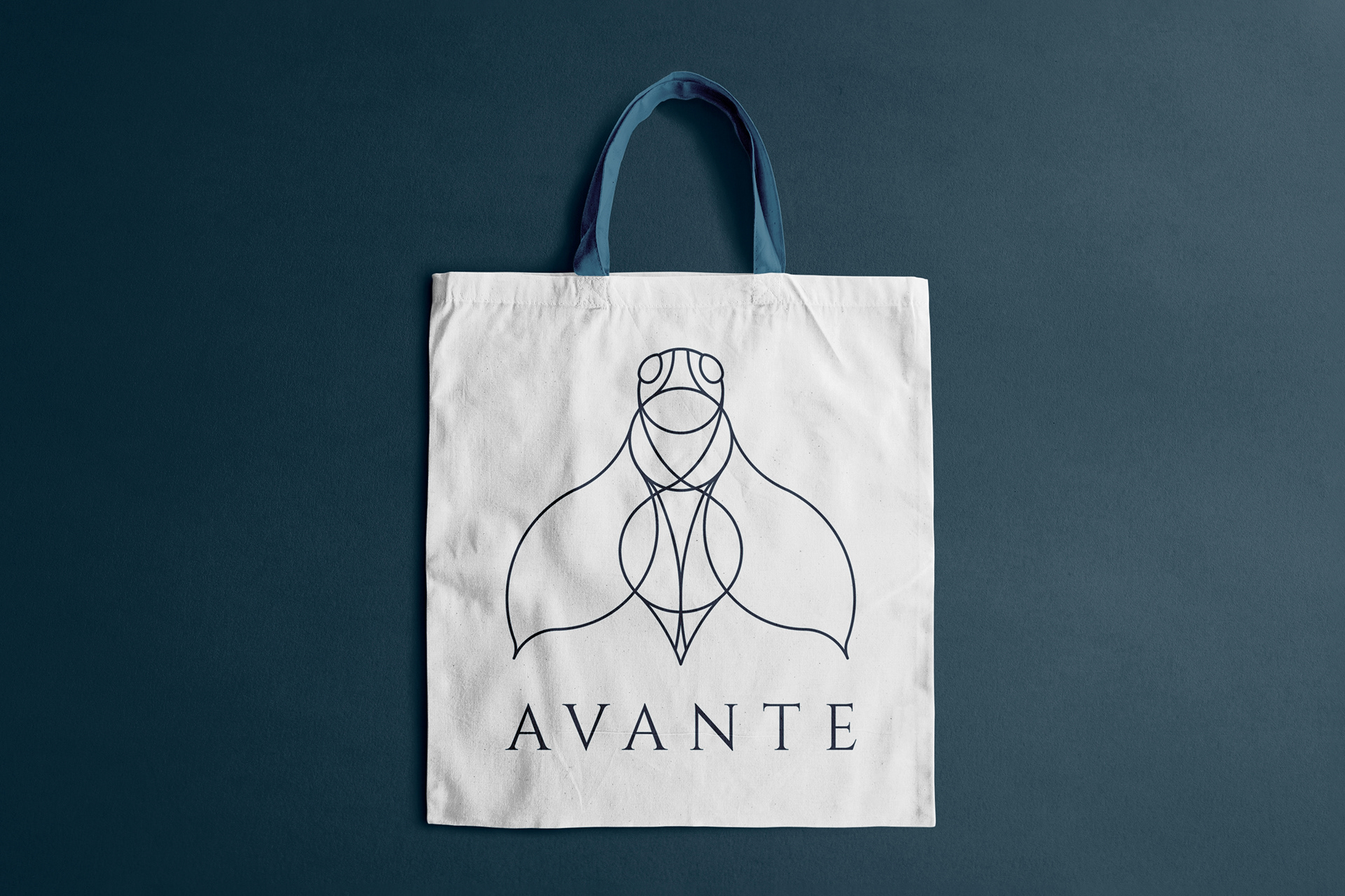
In my thesis project for my Graphic Design certificate, I designed the visual identity for a fictional cosmetics company called Avante. Focusing on an elegant and simple style, I designed the visual style for the brand including the logo, stationery, packaging, product design, advertising materials, online & offline presence. , catering to women who value high-quality skincare and cosmetics. Feel free to browse below and see the results of this branding project.





LOGO DEVELOPMENT
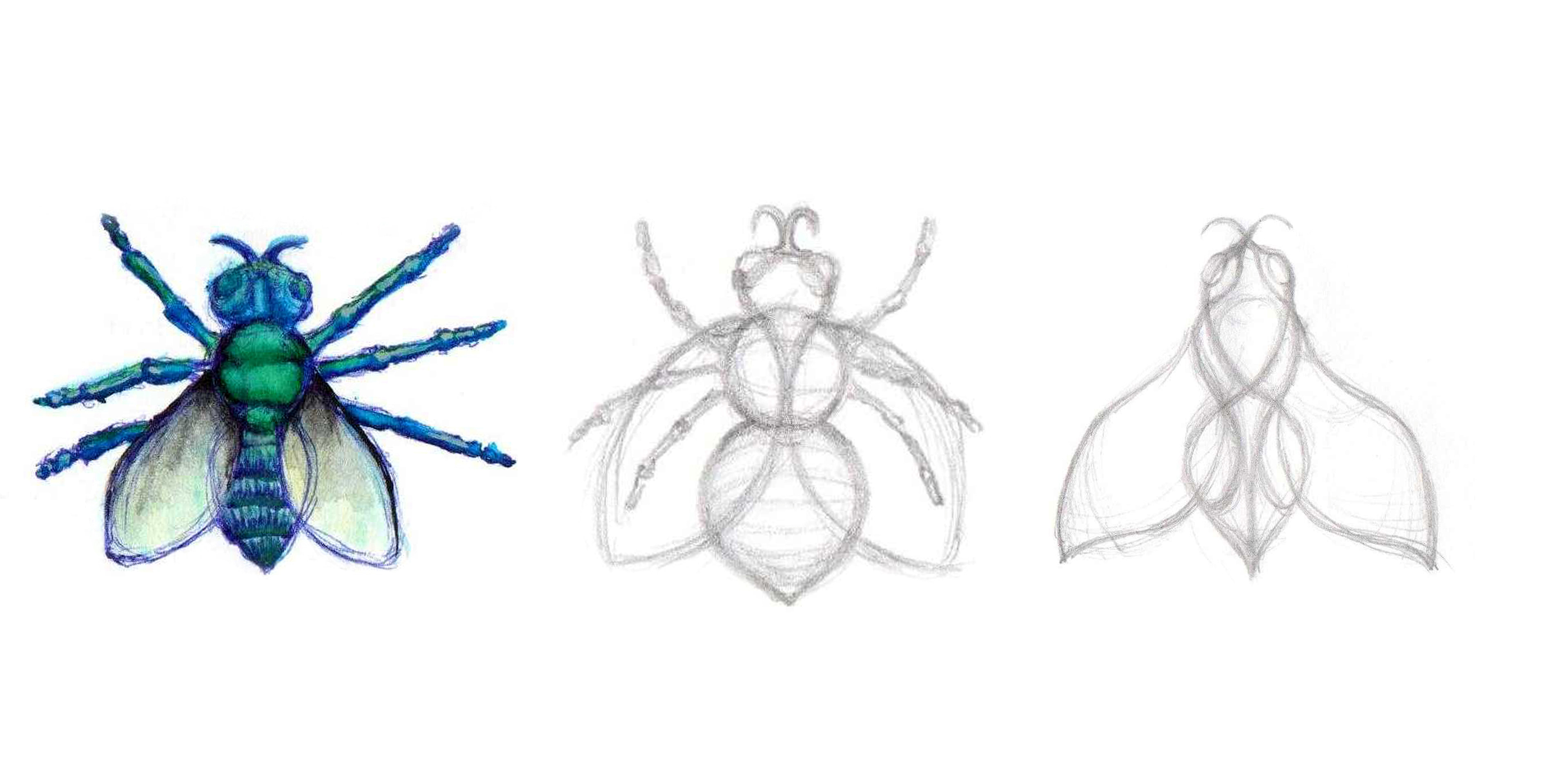
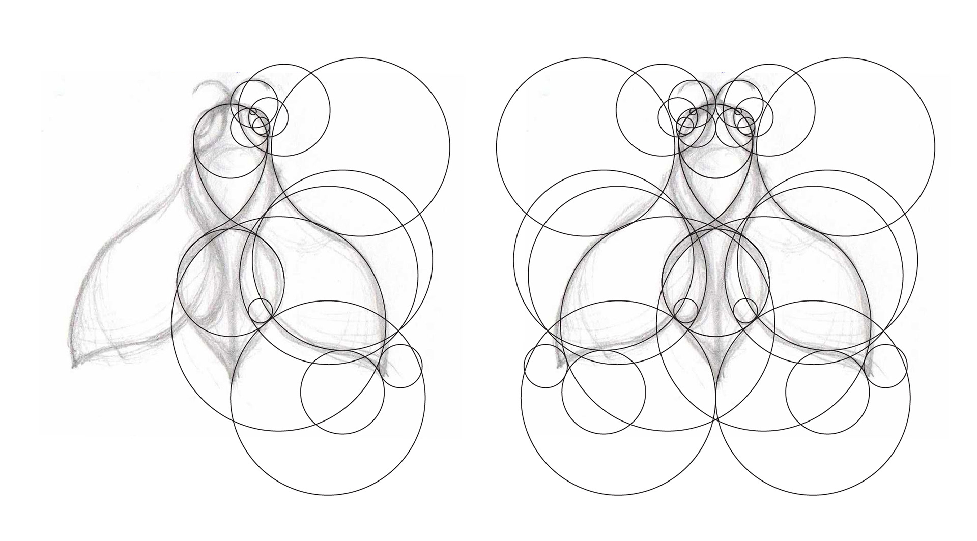
The logo design process began with analyzing beauty industry visuals, aiming for an elegant and an organic style. Inspired by nature, particularly insect and plant forms and by transitioning from hand-drawn sketches to digital design, a minimalist and elegant style was achieved with a winged beetle motif as the basic element.
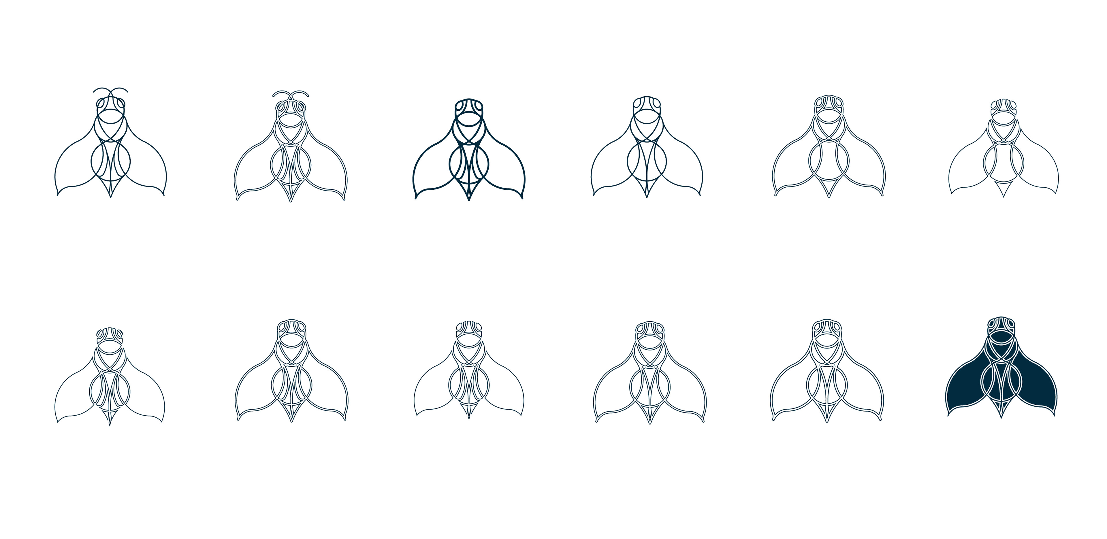


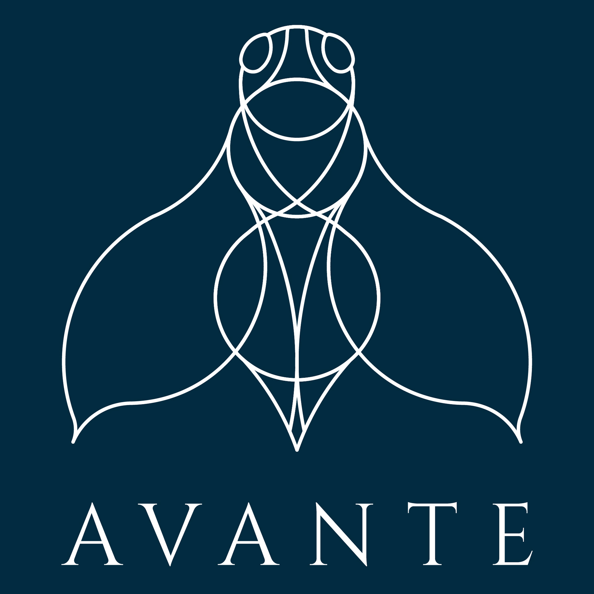

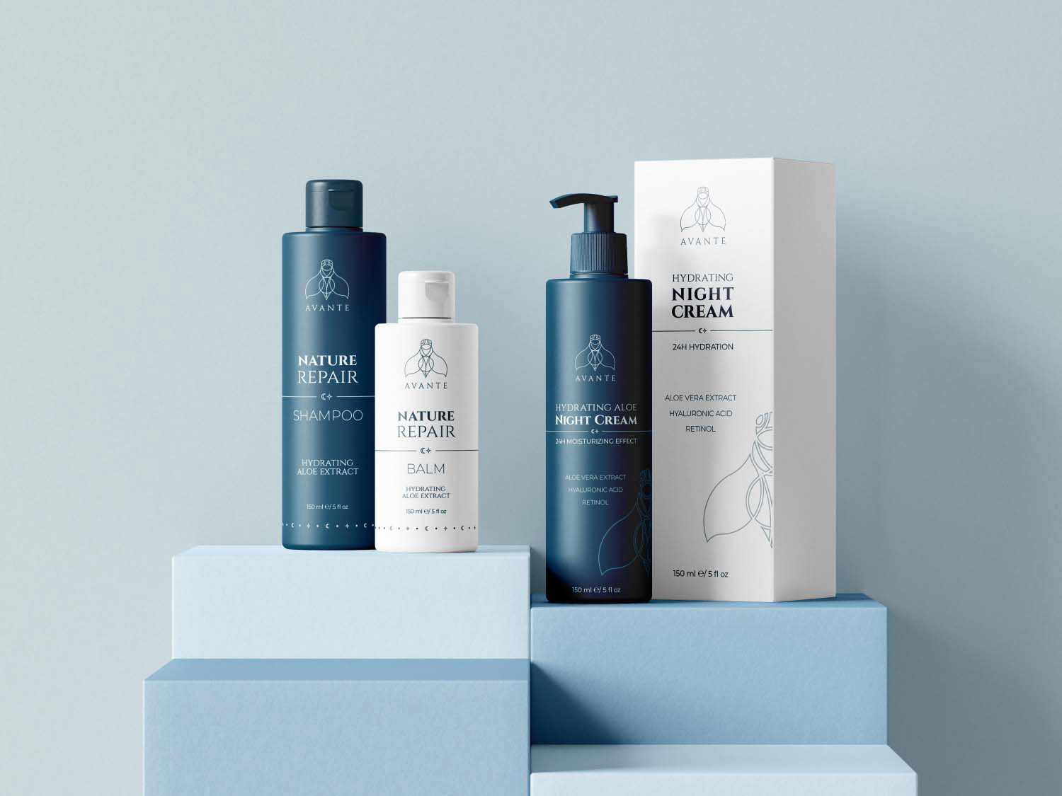
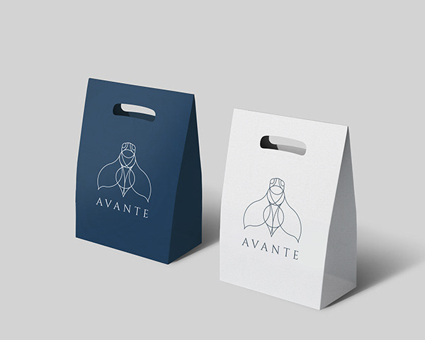
The final logo, presented in blue, white, and silver versions for packaging consistency, featured Cinzel serif typography for a classic aesthetic. Additional design elements, such as patterns of moon and star shapes, complemented the brand's elegant style.

STATIONERY DESIGN
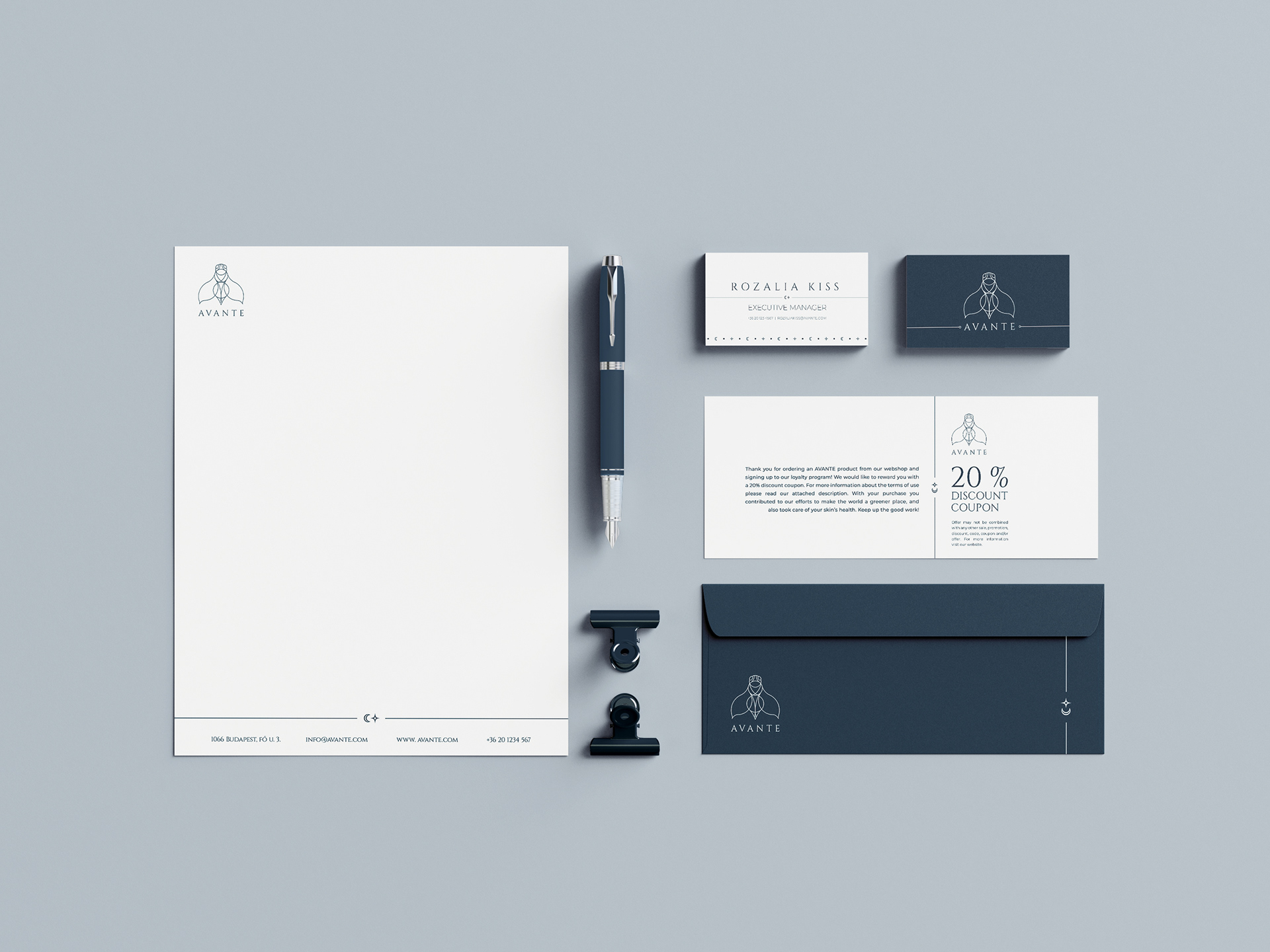
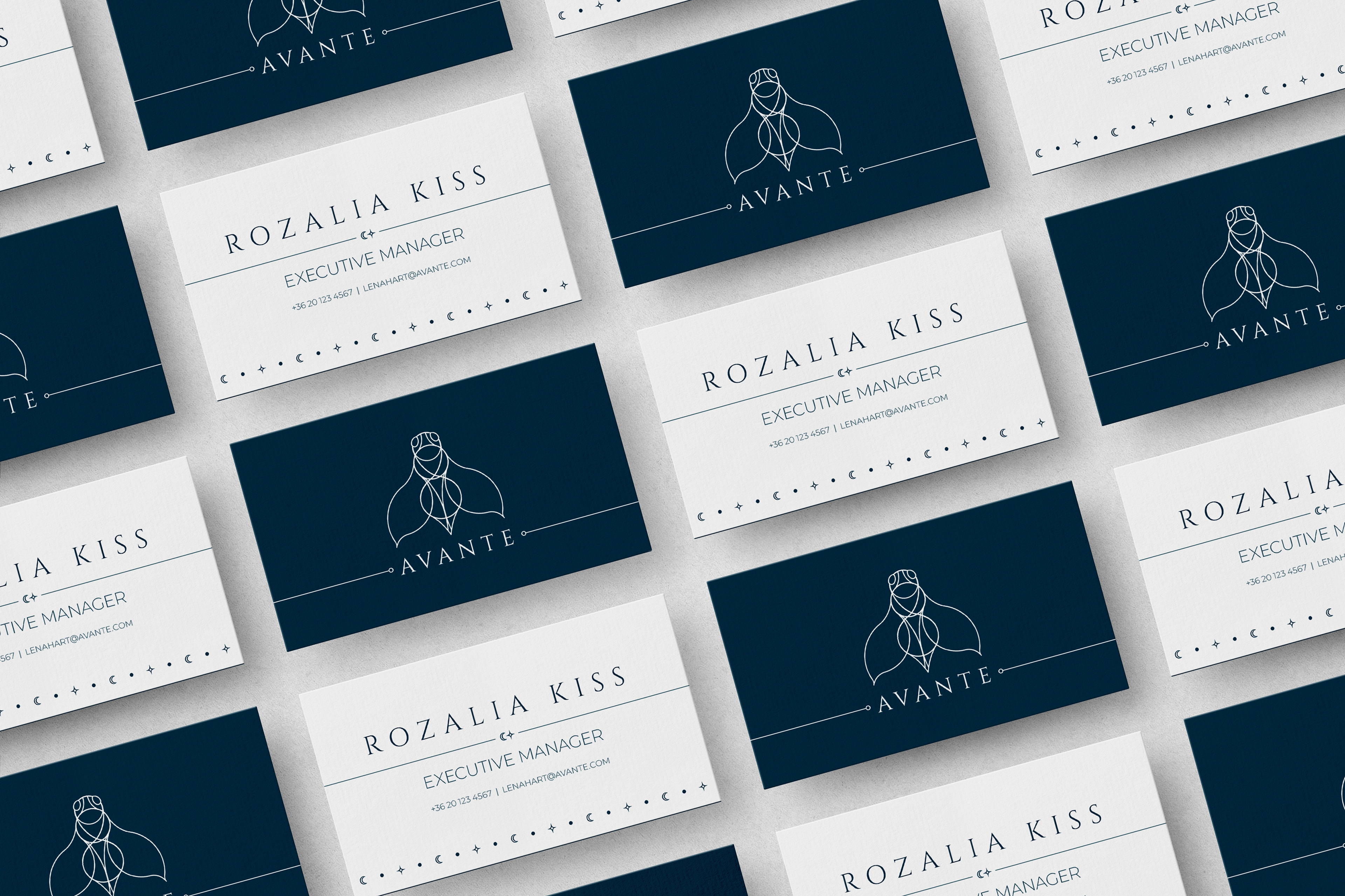
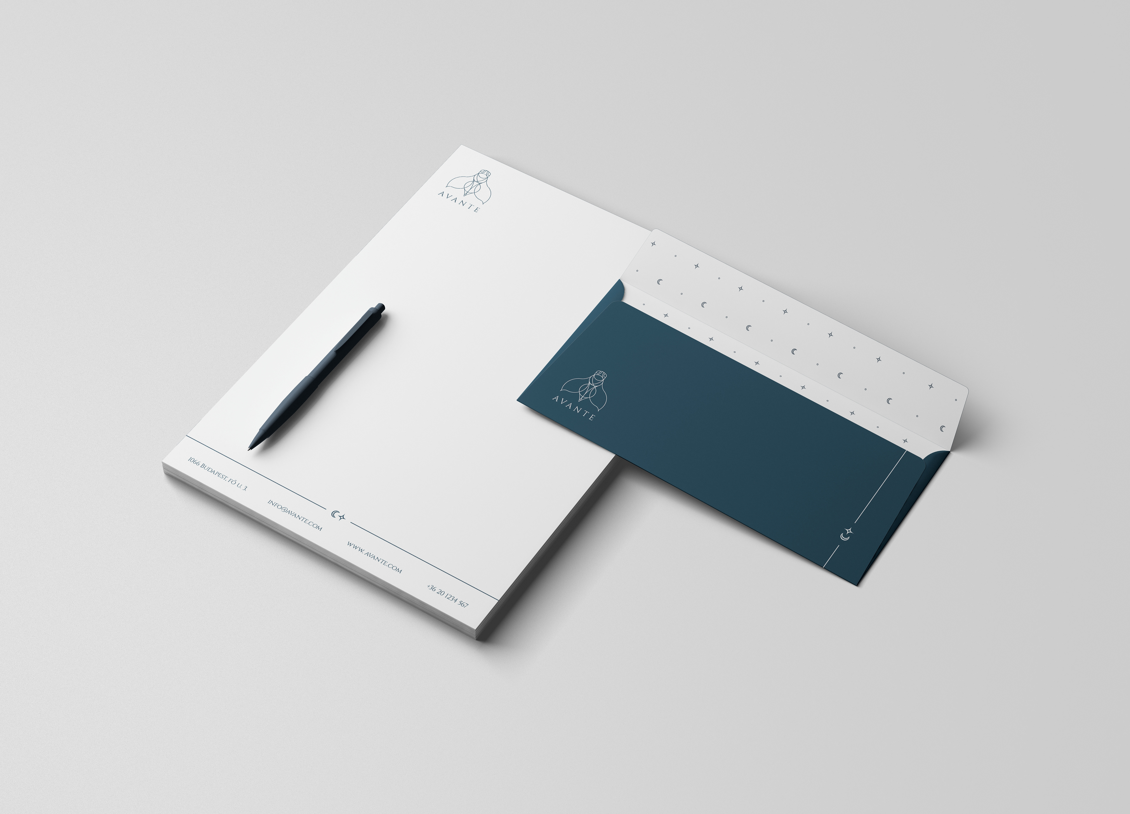
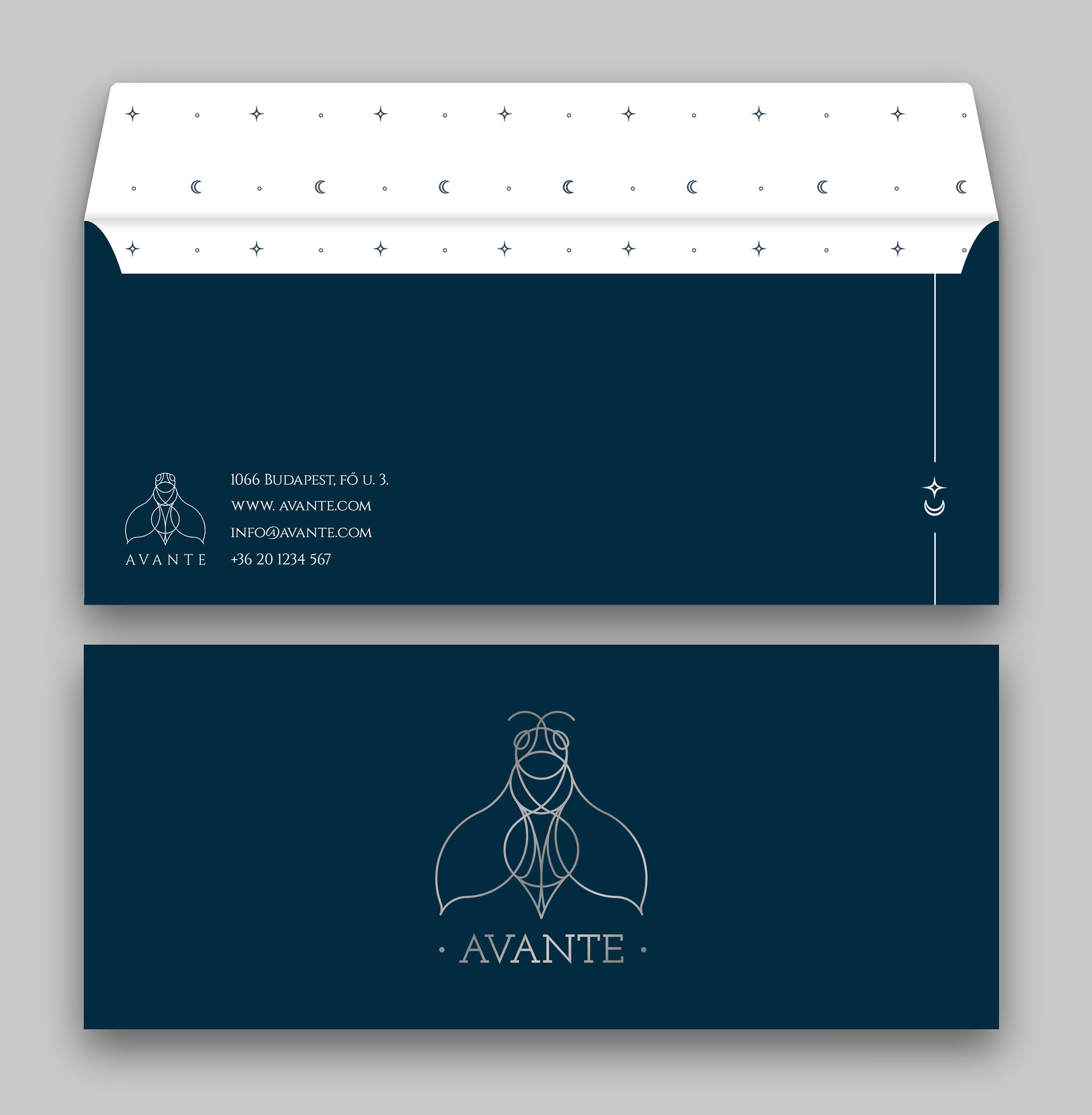
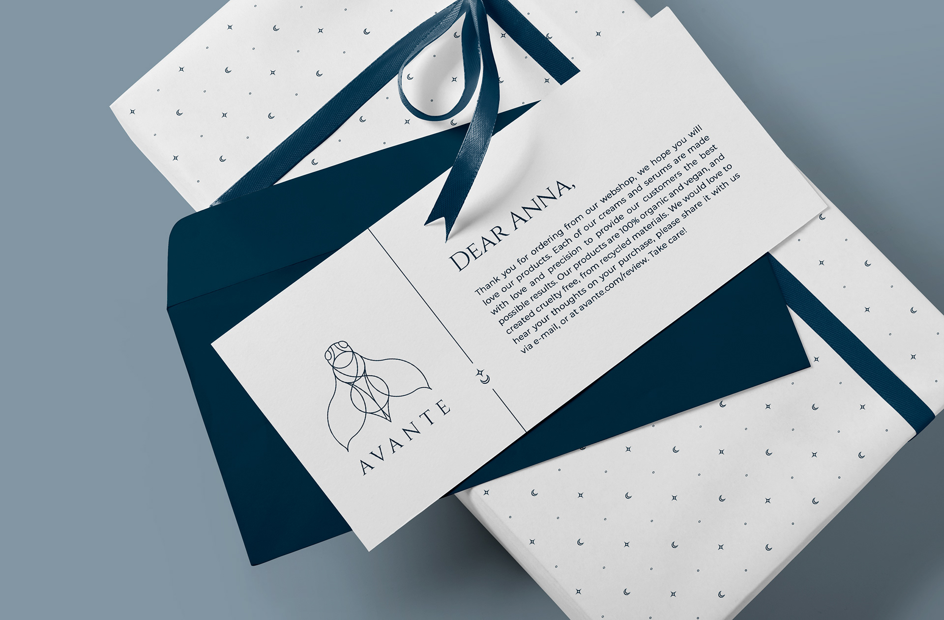
The business card and stationery design adhered to established aesthetic guidelines for a sleek and elegant appearance consistent with the brand's identity. The business card featured the logo and complementary design elements alongside text, emphasizing harmony and using the company's primary colors. Serif and sans-serif fonts were carefully chosen for hierarchy and cohesion. The letterhead and envelope design maintained the same elegant style, incorporating main brand colors and design elements for consistency, representing the company's identity with sophistication.

PRODUCT DESIGN, PACKAGING & ADVERTISEMENT
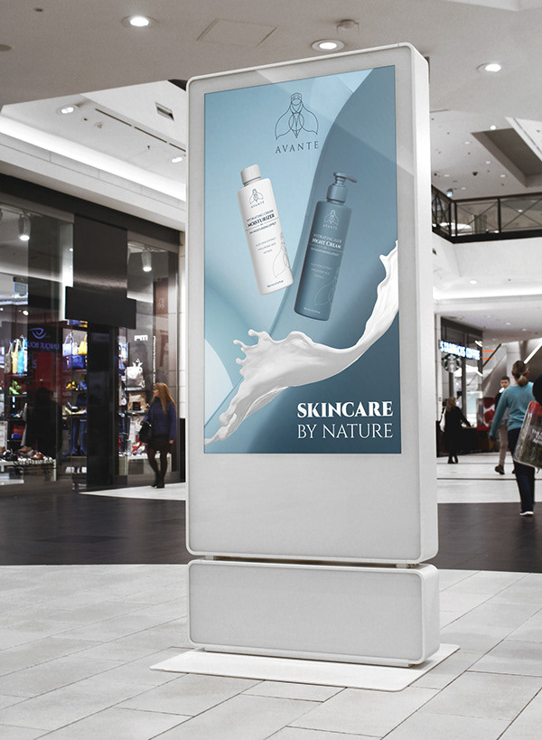
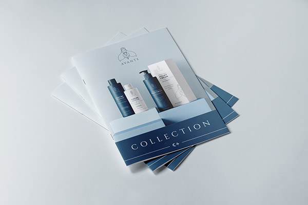
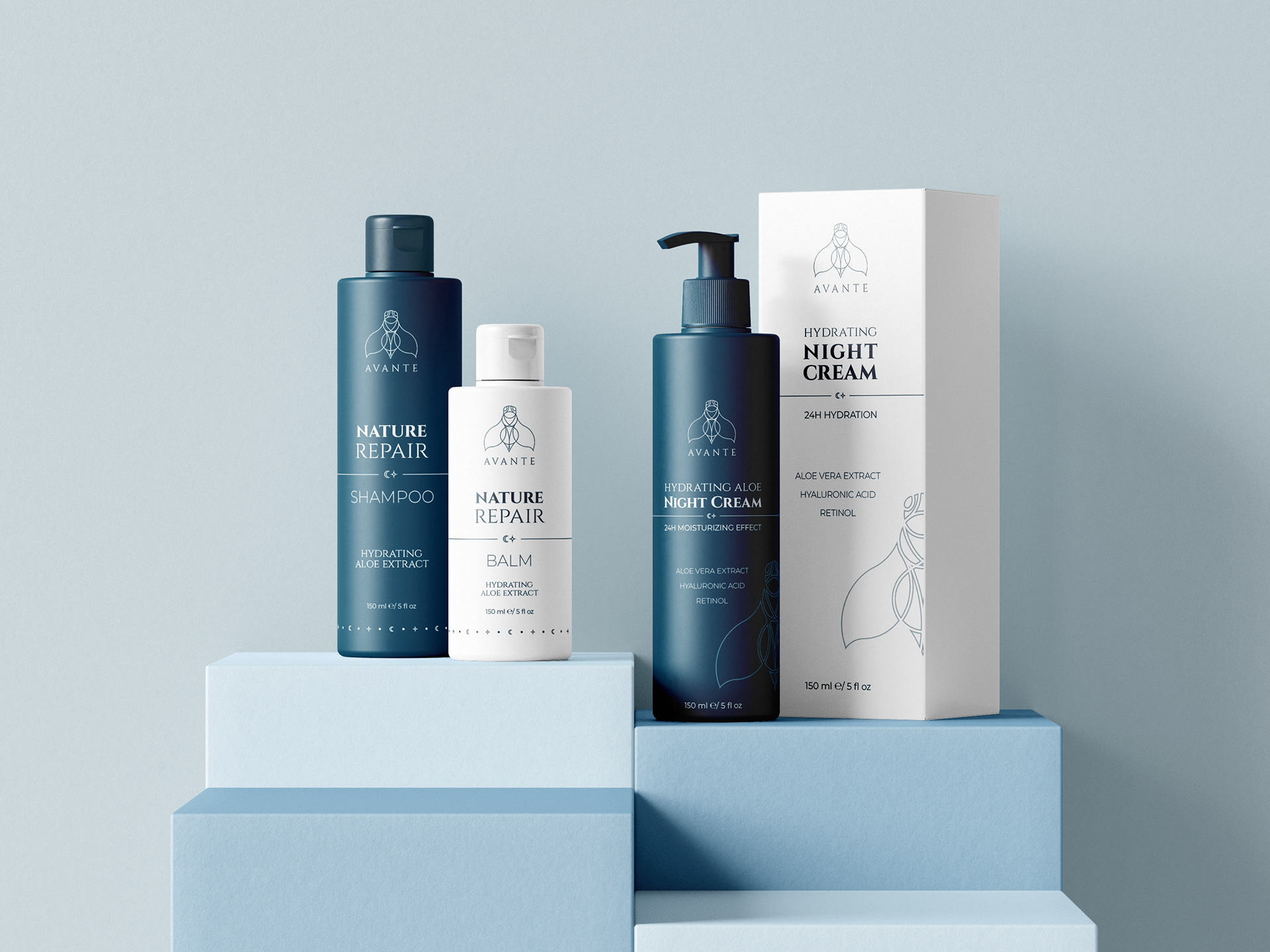
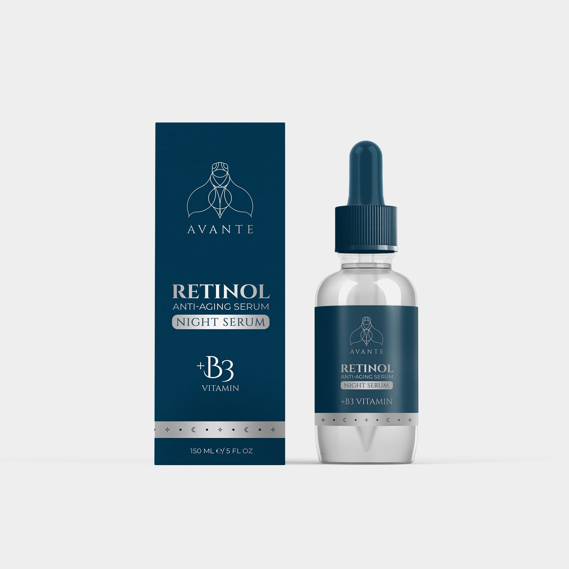
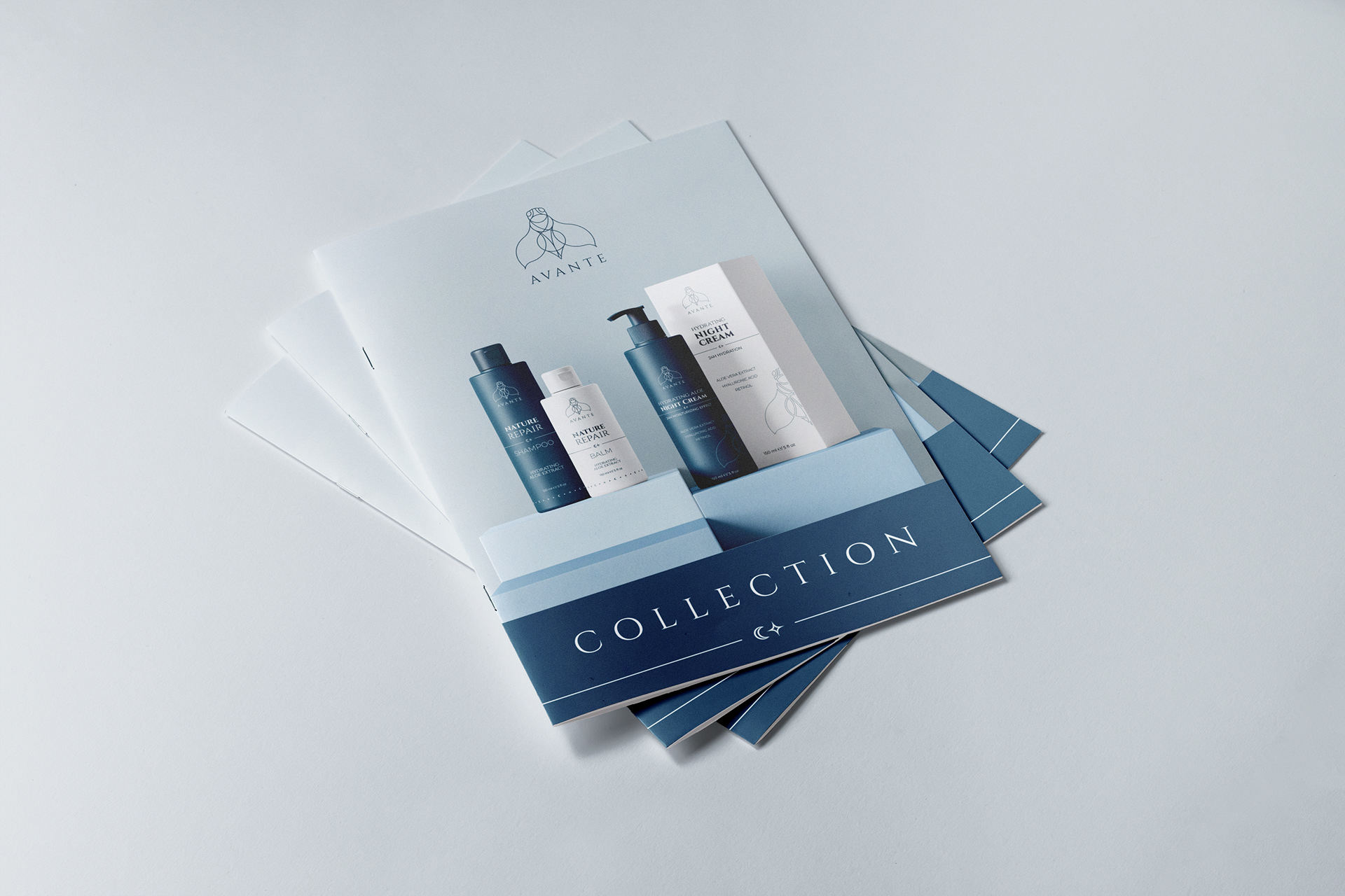
In designing the product packaging and marketing materials, I focused on an eye-catching view while staying true to the brand’s simple and elegant style. The advertisement poster highlights key product benefits and the brand’s sophistication with engaging visuals, while the flyer showcases a new product with images and details.





WEBDESIGN
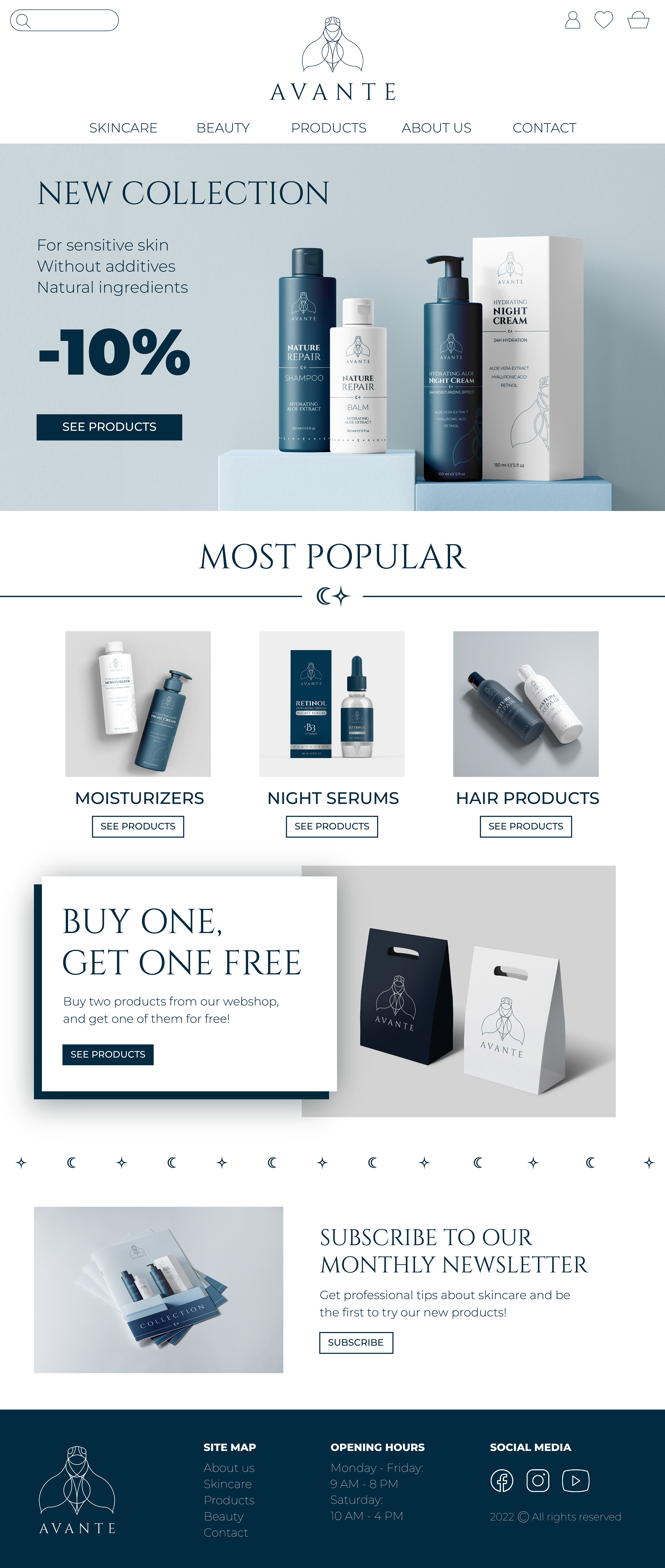
Developing the company's website was crucial for boosting online sales across all product categories. Given the competition's strong online presence, emphasis was placed on creating a sleek, elegant site that aligns with the brand's identity, but at the same time the design also prioritized clarity and user-friendliness, ensuring easy navigation for visitors to find products, promotions, and information.

PHYSICAL PRESENCE
The physical appearance of the company extends beyond its digital presence, manifesting in tangible forms such as branded paper accessories, apparel, and store decorations. Each element reflects the brand's identity, incorporating its logo, colors, and design motifs to create a cohesive and memorable experience for customers.
